Posts

Portfolio

Image
      The portfolio has opened my eyes and made me notice all the effort I put into my projects. Looking at all of them at once is very satisfying to me because I have been working on these for an entire semester. My uniqueness show in every single project since it's my design.

BW TO COLOR

Image
        This project helped me to learn more about photoshop. I enjoyed doing this project a lot because it was fun to play around with colors and mix and match. It was kind of challenging at first because I had a hard time figuring out how to mask and select places that I wanted to color. The reason I chose this picture is because it had a nice background that I could do a lot with and thought it was flattering. Also golf is one my favorite hobbies so the viewer can learn a little bit more about me. Each picture contained 5 different colors that I picked from Adobe color. The three types that I chose were Analogus, Double Split Complimentary, and Square.       I liked Analogus because my favourite colors are pink and purple so I liked how to had different shades of those two colors. Analogus was my simplest picture. I only focused on coloring myself in this picture because those colors were my favorite and I wanted my viewer to see that. The second one I did was double split complimen

Propaganda

Image
           This project is probably the most meaningful one to me. The Israeli and Palestine conflict has had an effect on me. I have always been pro Palestine and I will always be. This project was a good opportunity for me to spread awareness about this problem. I feel like people from the United States never really understood the Palestinians side because the Media here doesn't show it enough. So I am really hoping that me posting this can spread at least the smallest type of awareness and open people's eye to this conflict. As someone from the middle east, I hear about it more often than people here.         Using Illustrator was tricky at first but I got the hang of it the more I used it. I had to have a layer for each body part and had to color it one by one. It was hard finding the right colors. The trickiest body part was probably the eyes because I had to do the eyelids, eyeballs, eyelashes, and eye shape. The reason I picked red and green to be the main theme because

Somewhere

Image
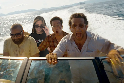
                This project was probably the most one out of all of them. The reason why I liked this a lot is because I had the opportunity to photoshop myself in the best movie ever. I grew up watching all the Hangover movies multiple of times. I still laugh like it's the first time watching it. I never ever get bored of it. Hangover is the type of movie that I watch when I am not having a good day or If I am feeling down. My favorite one is Hangover 2, and this scene in the picture was the funniest one in the whole movie. Everything about is funny. How messy their hair is, and most importantly their facial expressions.     The picture I took of myself, I purposely had messy hair so it can match the vibe of the picture. Because we're on a boat that is going fast so my hair has to be messy. The only difference that I did was that I made myself look like I was calm and relaxed, unlike them. They were screaming at the top of their lungs. I thought it was funny to make myself lo

Business Card

Image
          This project was very interesting because as someone who wants to own a business, thinking of business cards is actually a good idea. It was tough at first because I didn't know how to use Indesign correctly so it was a bit challenging at first but I was able to get the hang of it after a few tries. This project took me two classes to finish The first card I pretended to be a hairdresser and I my slang was "Hair dreams come true." At first I wanted to make it as "Make your hair dreams come true" but It didn't fit into the square. I used the colors turquoise and black together because I think it's more flattering. Also i created this logo with my name and above it it was a face of a girl showing her hair since my business is being a hair dresser. I did one side of the card turquoise and the other side black. But on each side I added small details of the the other colors to make it look better.      The second business card shows more of my girly

ID- H1

 Laila ElYassaki  ID- H1 Video 1:  https://www.youtube.com/watch?v=0eqhUFRlvgI     In this video, the creator showed hidden tools that I probably wouldn't have noticed without anyone telling me they exist. Such as pages and layers. The creator of the video also showed how to import images and make them fit the way we want. I didn't know we could just drag and drop an image in the frame so easily. For example, if want to fit it half a page or in the center of the page. He basically explained how to move around the gutters and I think that is very interesting because it makes things easier to edit. He also showed in the start of the video how to adjust the size of the frame however you want.  Video 2:   https://www.youtube.com/watch?v=QDfM8VmDRzQ     In this video, the creator goes in depth into the tools. The last video didn't really talk about the tools in the side bar so this video was really helpful. The pencil tool I feel it's kind of hard to use it because I don'
Image
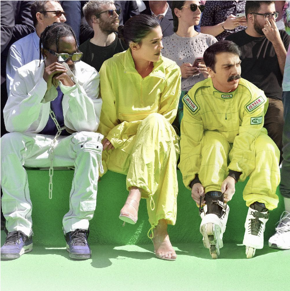
 Laila ElYassaki Photoshop homework 2     1. I feel like this image would be the hardest to photoshop myself in because there is no space for me to be in it. I cannot squeeze myself into it 2. I think that this image is funny and it inspires me to make a funny project for my somewhere assignment. 3. This image is hilarious I actually laughed out loud when I saw it. 4. I would remake this photo because its aesthetic and will look good on my instagram feed.